



I had the great privilege of being commissioned by St John’s College, University of Cambridge, to design three new logo identities for new spaces being built within the college itself — a buttery, bar and a cafe.
Before beginning the creative process I was taken on tours through the historical buildings of St John’s College. (It’s not everyday you walk over the Bridge of Sighs on your way to a design meeting!) Walking around the college, I was impacted by just how amazing the historical architecture is. There’s so many symbols, emblems and motifs woven through the distinctive shapes, curves and geometry of the buildings. Immediately I noticed that some symbols and emblems appeared more often than others: the yale, the eagle and the Marguerite daisy. I knew almost straight away that I wanted to incorporate these important symbols into the logo designs themselves.
For the buttery logo design I chose the eagle, especially apt because as people walk into the new buttery building, they pass two huge pillars with stone eagles perched atop them. For the B of the logo I’ve used a simple eagle-like form crouching down as if feeding young to create the curve of the letter. I’ve then placed an eagle on top of the wordmark itself, the curve of the wings and complementing the letters below, and the joined T’s where the legs might appear.
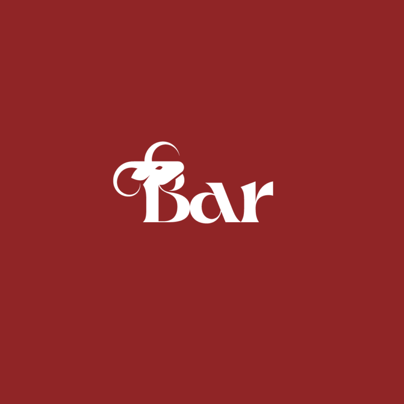
For the bar logo I used the yale. The yale is an interesting heraldic mythical creature, quite antelope/goat-like, with horns that can move and a distinctive goat-beard hanging below the chin. I’ve incorporated the head of a yale into the letter B, it’s neck forming the descender of the letter, and the chin beard forms the upper curve.
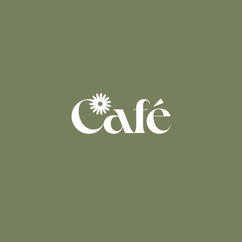
For the cafe logo design I simply allowed the shape of the letter C to form the stem of a Marguerite daisy — a simple, elegant shape that was useful for other brand materials, such as menus and digital screen backgrounds used in the cafe itself.
The new spaces are different, but join to form a hub, so to demonstrate this I’ve used the same font for each logo design, Crake. Crake is perfect for this project because, just like the architecture of St John’s itself, the font combines organic and geometric forms.
A privilege to design new identities for a place so steeped in history.







Clients


